Design system · Theming · B2B SaaS · Visual design · Freelance
Four job-portal products, one design system, one switch between them.
A job portal with a separate product for each side of hiring. As the only designer, I redesigned two products, designed two from scratch, and built one system under all four, so a candidate screen and an admin screen differ in hue and nothing else.
- Role
- Freelance product designer. Owner of the design system
- Team
- Solo designer, with the client's product team and developers
- Timeline
- 2 months, 2026
- Status
- Handed off to development
The client. The client runs a job portal with four products across seven apps: Candidate and Employer on web and mobile, Admin on web and mobile, and Super admin on web. Each product had been built on its own, so every new screen started as a copy, and the products no longer looked like one company.
In short. I audited the early build's styles first, then rebuilt from the foundation: colours named by their job, a brand switch that turns candidate purple into internal blue, and one library of masters for mobile and web.
277 tokens, 82 component sets and about 600 screens, redesigned or new, in two months.
- design system behind four products
- 1
- colour themes from one component set
- 4
- screens redesigned or built new on it
- ~600
A redesign with nothing to build on.
An agency designed the first Candidate and Admin products. The client brought me in to redesign both, design Employer and Super admin from scratch, and give his developers a system to build from.
What I heard
- The look wasn't rightClientThe client didn't like how the agency's design looked, on any of the products.
- Two brands, two modesClientPurple for candidates and blue for the internal teams, each in light and dark.
- Devs complainedClientWith no design system behind the screens, every build problem ended up with him.
- No rules to build fromDevelopersThey wanted proper guidelines for every basic component and for spacing. Without them, each screen was hard to build.
So before redesigning a single screen, I went through what the early build actually contained.
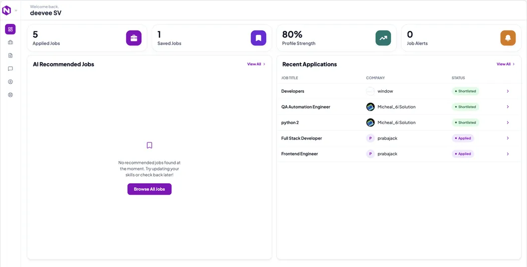
Nothing in the early build was shared.
I went through the old styles and screens before designing anything. Eight problems stood out, ranked here by how much damage they did.
problems, ranked by damage
From the early build's styles and screens, before I designed anything.
| Problem | In the early build | What it cost |
|---|---|---|
| No one owned the quality | New components kept going into the system, but no one checked that each was built properly | Nothing stopped the problems below from spreading |
| Four copies of one palette | Colours, spacing and radius saved four times. The colour sets held 8, 8, 5 and 8 values | A fix in one copy never reached the other three |
| Same name, different colour | "Neutral 4" was grey #989997 in one copy and beige #C9B49A in another | Picking a colour by its name could give you the wrong one |
| Look-alike values | Background #FDFCFB against #FCFCFB, accent #B69978 against #B69977 | Nobody could say which one was right |
| Icons that never sat right | Each icon carried its own padding | Two icons at the same size looked like different sizes |
| Missing roles | Only one copy had a secondary text colour | Grey text was picked by eye, screen by screen |
| Raw values only | Every colour and size was a raw value. None was named by its job, and there were no modes | A new brand or a dark theme meant editing every screen |
| Wireframes for consoles | Admin and super admin web started as 153 screens of wireframes | The internal products had no visual language to build on |
If something looks wrong in blue, the fix is a token, not a new component.
That one rule, written into the file, kept four products on one system.
Colours named by their job, so one switch can retheme a product.
I built the tokens first, then the mobile and web libraries on top, then rebuilt every product on them.
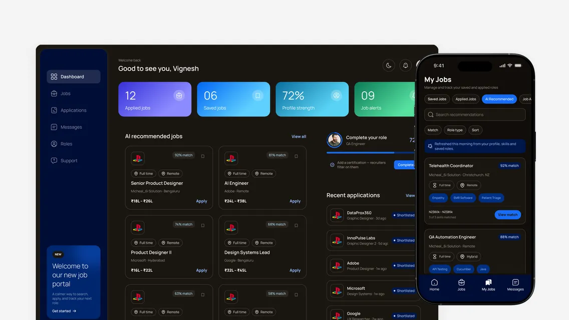
Same components · one switch
Candidate brand, light mode. Purple for the candidate products.
Candidate brand, dark mode. The same screens; only the Theme layer changes.
Internal brand, light mode. Blue for the admin, employer and super admin products.
Internal brand, dark mode. Two switches, two values each: four themes.
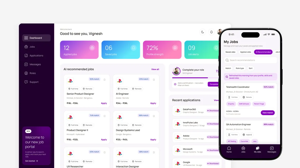
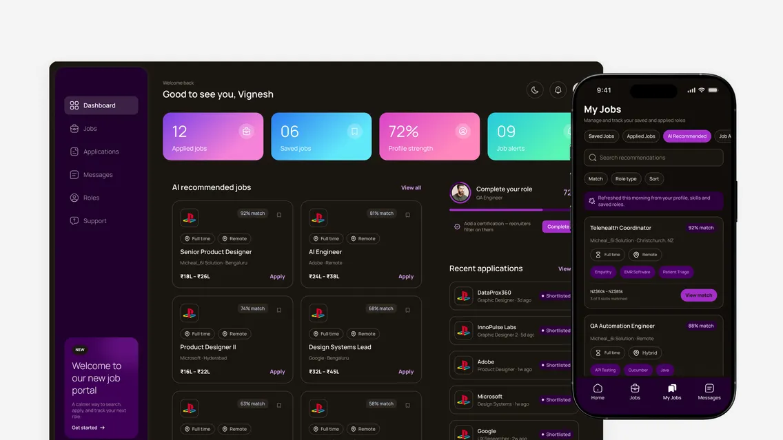
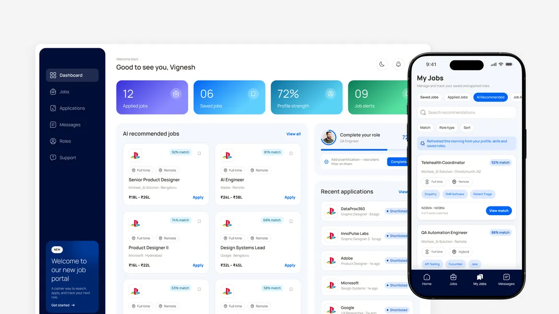
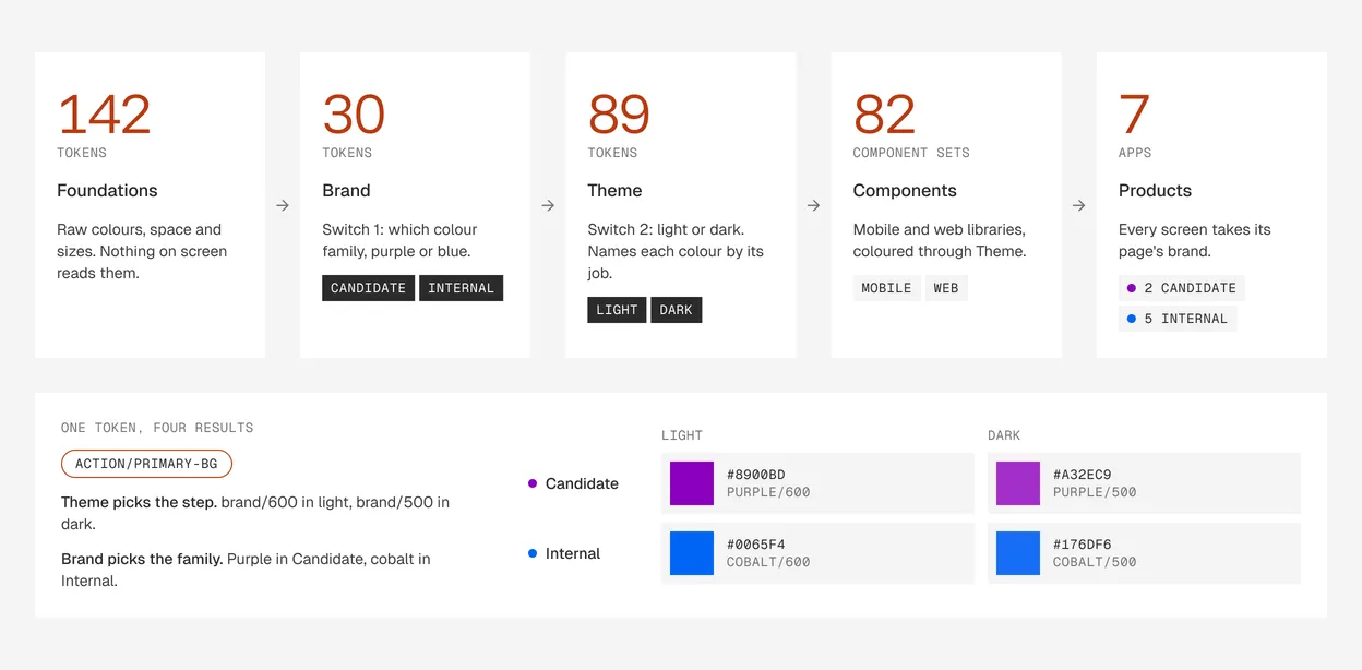
System. From raw values to seven apps, in five steps
A token is a named setting a component reads instead of a raw colour. Here is the whole chain, from raw values to the products.
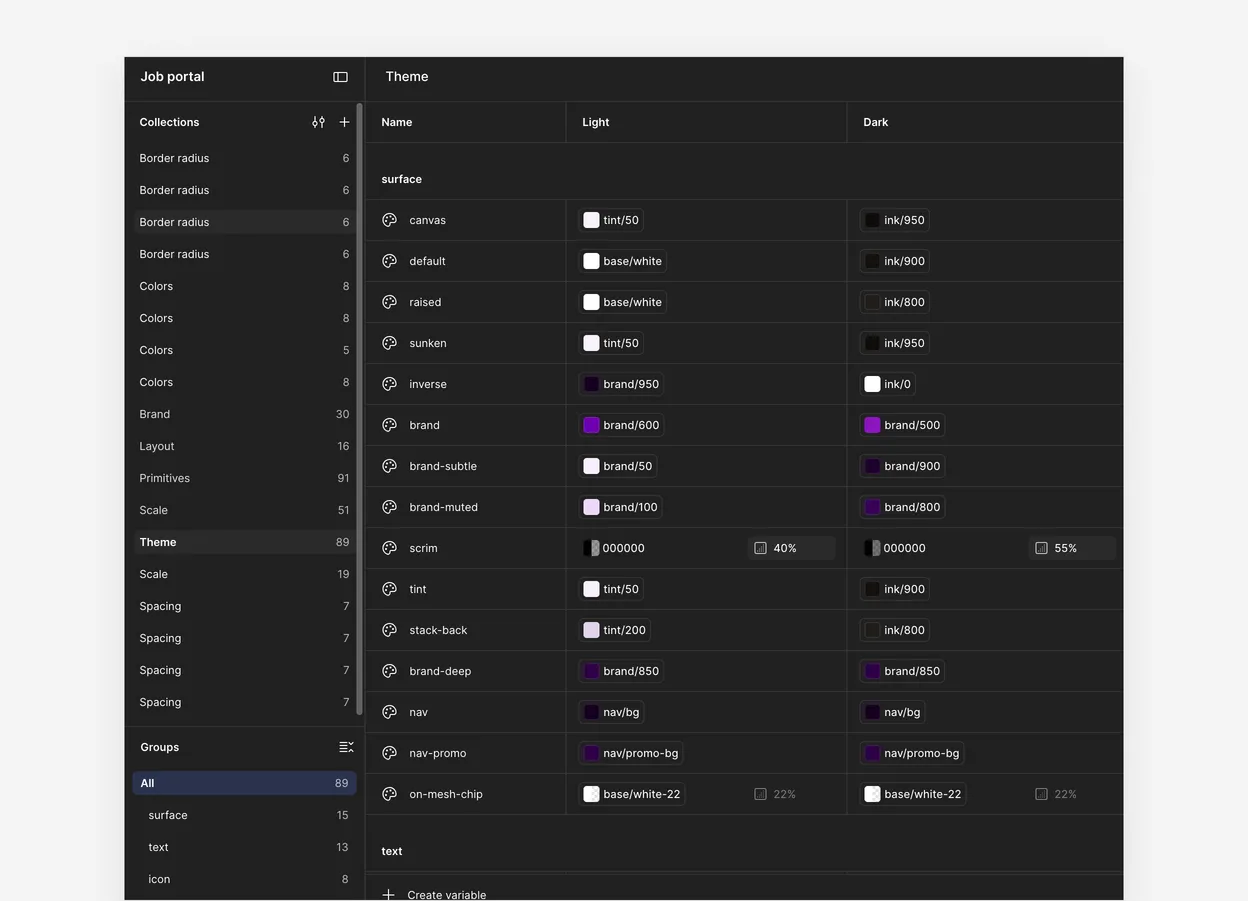
Light and dark. Dark mode is a column of links, not a second palette
64 of the 89 named colours change in dark. The other 25, like white text on brand buttons, stay put. Dark mode is a second column of links, not a second set of colours.
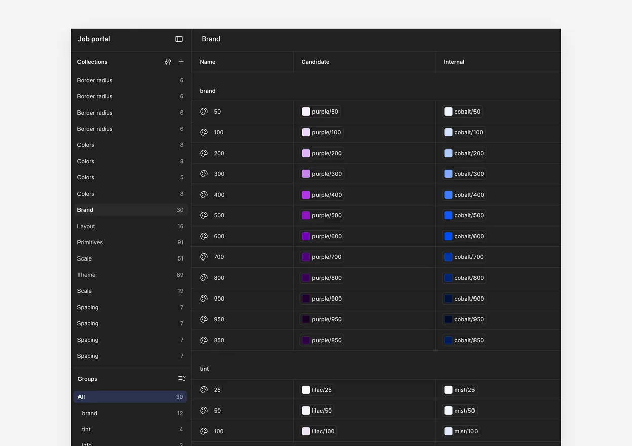
Brands. Purple to blue is one setting
Flip the Brand layer from Candidate to Internal and 38 of 89 colours change. The other 51 stay, including every success, warning, danger and border colour, so a status means the same thing in both brands.
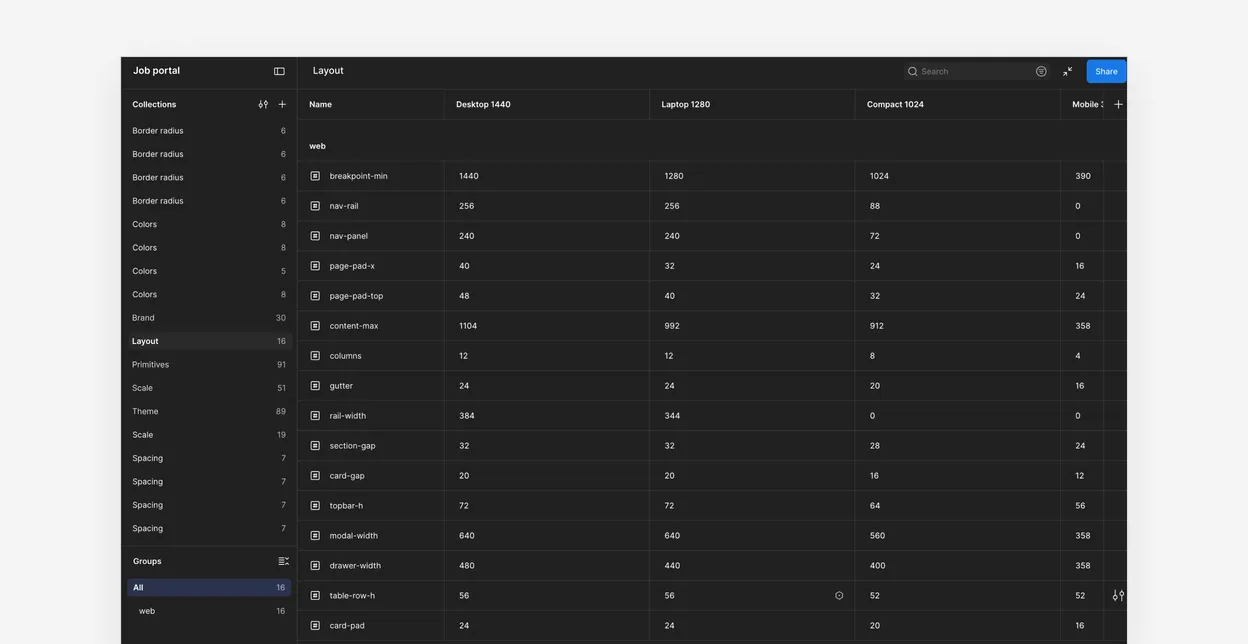
Layout. One shell, four breakpoints
The web shell reads its grid, padding and panel sizes from one collection with four breakpoint modes.
Library. Every component is a master, every use a variant
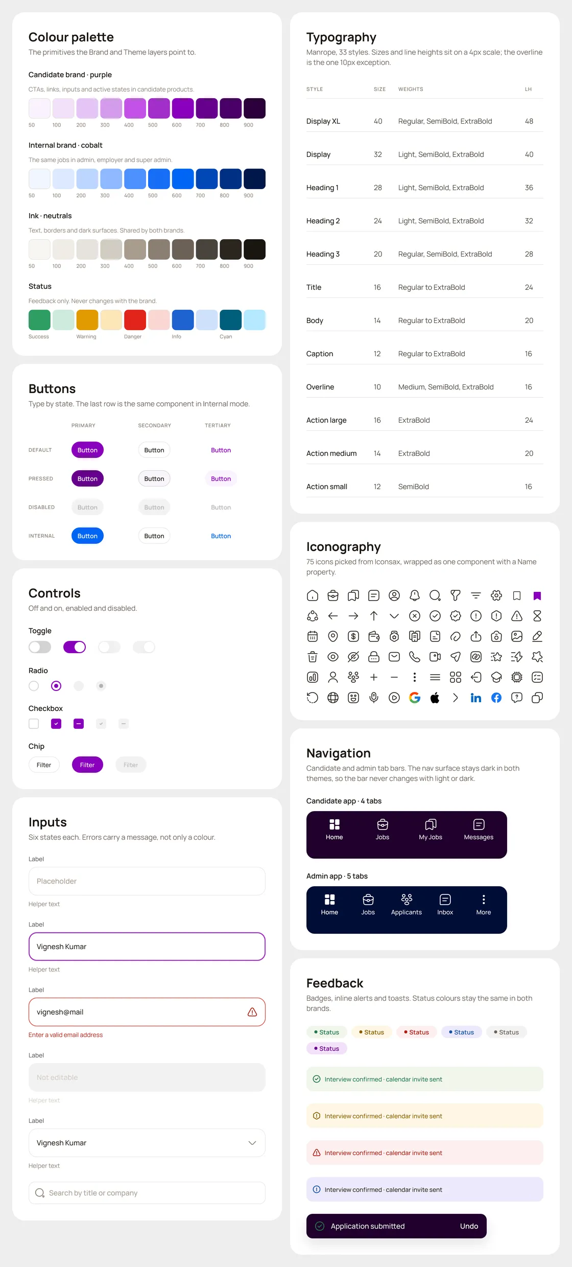
The web button is one master with 45 variants: 5 types, 3 sizes, 3 states. One side nav serves all four roles through a Role property. The eight boards are built from the live components.
smaller calls that kept it honest
Each one is small. Together they're why the library stayed in one piece.
- Two shadow sets, one per platformPhones got five levels, from card to bottom bar. Web got three: nav, popover and modal.
- Icons picked, not drawn75 icons from Iconsax, wrapped in one Icon component, out of about 2,000 in the set.
- A weekly check with developersEvery week we went through what had been built, so Figma and the build stayed the same.
rules, written where developers would see them
They sit on the How to apply board, next to the brand modes.
- Bind to jobs, not coloursNever a primitive, never a raw hex.
- Never copy for a platformIf it looks wrong in blue, fix the token.
- Keep the blue on 600It's the step contrast was checked at, in both themes.
- No new mode per productA new internal product points its page at Internal.
I owned the system for all four products.
From 95 loose values to one system of 277.
The redesign is with the developers, so these numbers come from the design file, not the build.
The numbers
- tokens in five layers, up from 95 raw values
- 277
- component sets, with 534 variants
- 82
- component instances in the screens
- 17,705
- of web component fills read a token
- 92%
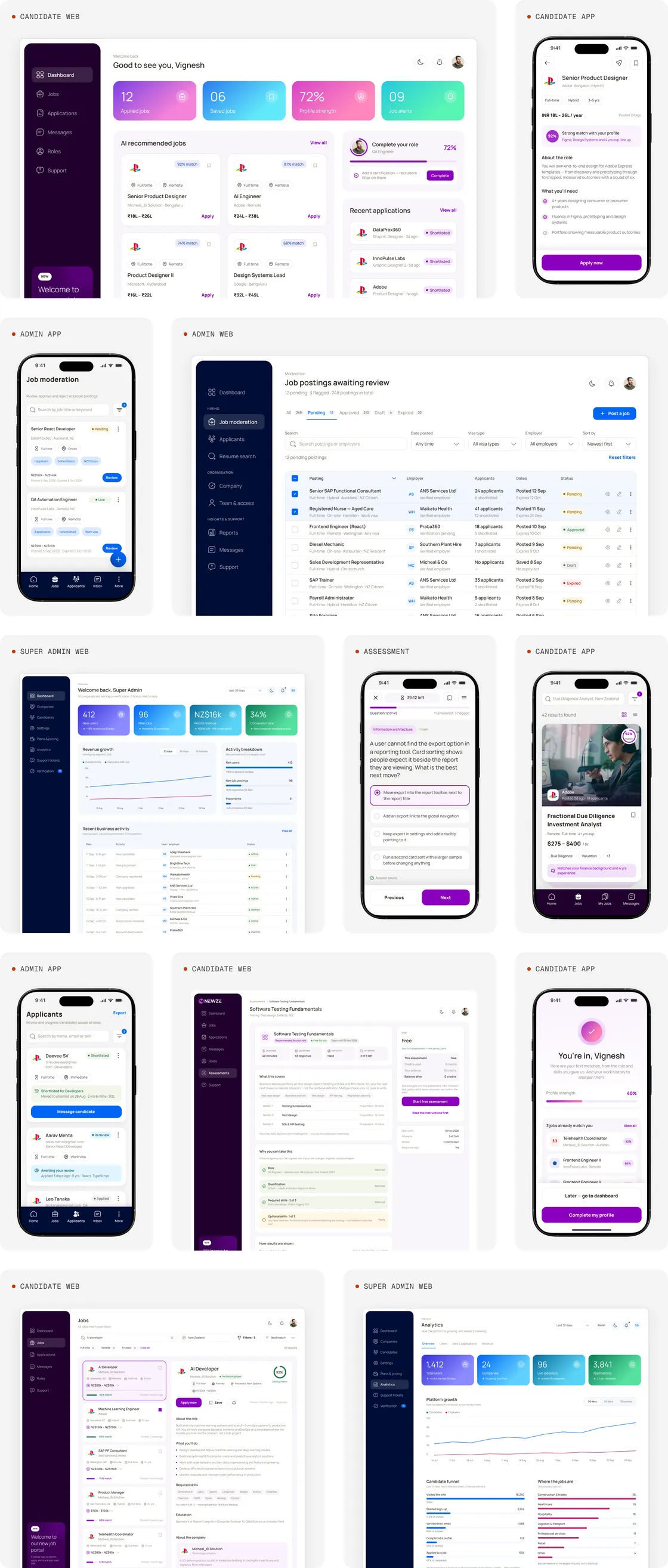
Every product, redesigned on one system
Purple tiles run in Candidate mode, blue tiles in Internal. Nothing was redrawn per product.
What I'd do differently.
- 01Test every component in all four themesDark mode passed on web and broke on mobile: the tab bar turned white and its labels disappeared. A four-theme check per component would have caught it early.
- 02Check contrast on the quiet colours tooGrey secondary text sits at 3.88:1 on white, under the 4.5:1 minimum for body text. I'd move it a step darker before handoff.
- 03Check each screen's bindings before handoffA few mobile screens still had typed-in colours.
Still open: how fully the developers use the tokens in code, and whether dark mode ships.
The project, at a glance.
- ClientA job portal, name withheld. Freelance project.
- ToolsFigma variables, modes and component properties for the system. Iconsax for the icon set.
Next case study
Karnataka BankRebuilding a 100-year-old bank's app customers called undependable.