Banking · App redesign · UX research · Design system · Visual direction
Rebuilding a 100-year-old bank's app customers calledundependable.
KBL Mobile Plus is Karnataka Bank's mobile banking app. I worked on its redesign, from research to the screens that shipped on iOS and Android in January 2026.
Role
Senior Product Designer
Team
Four designers at NetBramha, the bank's leadership, LCode
The client. Karnataka Bank has served India since 1924. It runs about 900 branches and more than 13 million customers. For a growing share of them, KBL Mobile Plus is the only branch they ever visit.
In short. The old app had 23 modules in no order, and payments often ended without a clear answer. Four designers rebuilt it: research in five cities, three principles, four clear sections and a design system the bank can extend.
81%user satisfaction rose in early testing
Four designers,and a hundred years of process to work with.
Everyone on this list could stop a decision.
Design team
A project lead, a junior UX designer, a visual designer and me, with a project manager, all at NetBramha.
Karnataka Bank
Leaders signed off every direction. A lead engineer set the limits.
Dev team
LCode's iOS and Android teams, who built the shipped app.
My part.Senior Product Designer
Ran fieldwork: framed the questions and led 27 of the 45 interviews
Turned the research into findings, the expert review and the competitor benchmark
Owned the information architecture
Drew all the wireframes
Set the visual direction with our visual designer and built half the component library
Designed 12 major flows in high fidelity, including onboarding, home, payments, UPI, finance and deposits
01What customers told us
We studied the old app three ways.It was falling behind on all three.
AAn expert review, a comparison with five other banking apps, and interviews with customers in five cities.
Expert review
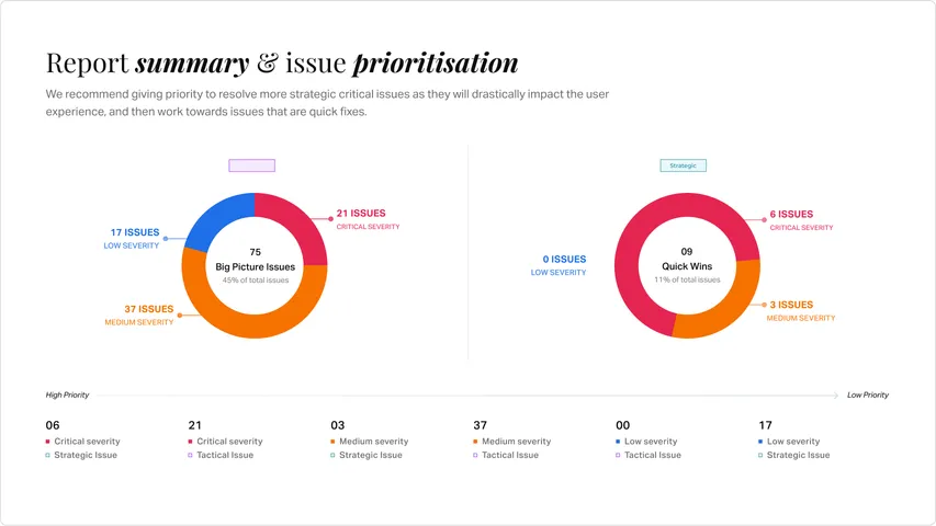
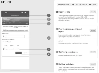
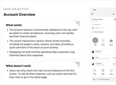
84 issues
found in an expert review against 12 usability rules.
89% quick fixes (75 issues)
11% bigger, long-term fixes (9 issues)
3.3
out of 5 for the old app.The best: 4.25.
We scored it against five other banking apps in nine areas.
Category
Comp. A
Comp. B
Comp. C
Comp. D
Comp. E
Old KTK app
Overall rating
3.6
4.25
3.8
4
3
3.3
Homepage
3
3
3
3.5
2
3
Account details
3
·
3
3.5
3
3
Login
3
3.5
3
3.5
3
3
Fund transfer
3
·
3
3.5
3
3.5
Bill payments
3
4.5
3
·
3
·
Finance manager
3
·
3
·
·
·
UPI
3
4.5
3
3
3
3.5
Deposits
3.5
·
3
3.5
3
3
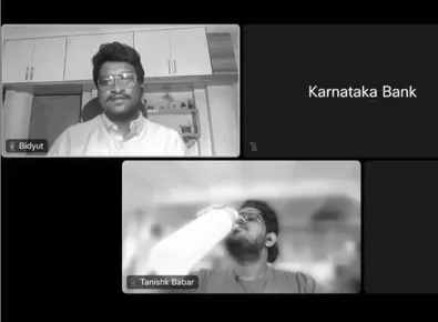
Five cities, 45 conversations. The same five complaintscame up in every city.
74%Never found help on their ownSupport sat four taps deep, in a menu most people never opened.
61%Were never warned about downtimeMaintenance arrived without notice, so people found out when a payment failed.
41%Finished a payment unsure it went throughTransactions ended without a clear success or failure.
37%Dropped off in the middle of a taskLate one-time passwords, a slow app and sudden logouts stopped payments halfway.
32%Found the text hard to readSenior citizens, almost 30% of the bank's customers, struggled with the default sizes.
“
Sometimes the amount gets transferred to the recipient successfully,but the feedback doesn't show on my app for a while.
General customer, Hubli
HeuristicsCompetitors BenchmarkingThe interview sessions behind the five findings above.
Design can't fix the server.It can make sure people always know where their money is.
Late one-time passwords and surprise downtime came from the bank's servers, not the screens. We wrote them down as limits in the research report and showed them to the bank's product and marketing heads in June 2024.
02What we decided
We agreed what design could fix,then set three rules for every screen.
Three rules every screen had to pass
Each principle came with a simple check.
01
Clarity
Every screen shows what just happened, so nobody has to guess.
02
Access
Core tasks within two taps, and help on every page.
03
Trust
Clear feedback at every step, so no payment feels uncertain.
Three customer groups came first
The bank asked us to design for them before anyone else.
Millennial
Comfortable with tech. Expects speed, modern patterns and no dead ends.
General
The bank's largest group. Needs clarity, signs it can trust, and text it can read.
Small business owners
Designed
Several accounts to track, one view of their whole position, and direct access to a relationship manager.
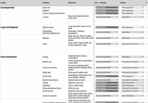
Features ranked by value to customers against the cost to build.Information Architecture
03What we designed
Four sections, two taps to anything, and payments thatalways end clearly.
23
modules,regrouped into four sections
They sat in one flat pile. We grouped them by what people came to do.
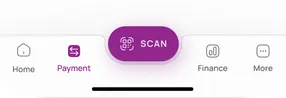
Sending money comes firstSearch, QR scan and the four transfer types sit at the top, so the most common task is one tap away.
Everything else, in one placeBills, FASTag, cardless cash, scheduled payments and standing instructions share one section, with tags for overdue bills and new features.
Proof before you leaveSaved payees, recent transactions by account and a monthly spend summary, closing with UPI safety tips and the NPCI security mark.
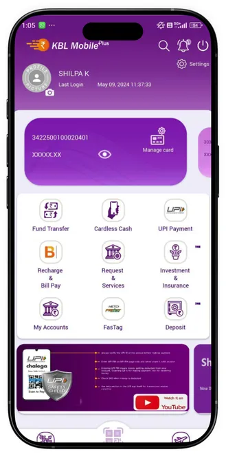
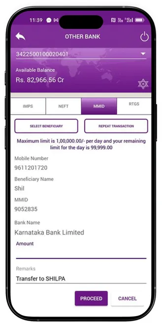
Before: transfers, UPI and bill payments were separate items in the flat list of 23 modules.
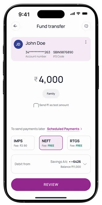
Fund transfer.See every detail before the money moves.
BeforeAfter
The old way to pay
No review before payingThe details were never shown back to you before the money left.
No clear resultSuccess or failure came only by SMS, and sometimes not at all.
The new way to pay
Clear at a glancePayee, amount and status are easy to read on one screen.
Test with ₹1 firstSend ₹1 to a new payee before you send the full amount.
Fees before you payIMPS, NEFT and RTGS fees show next to each option, before you review.
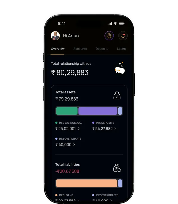
Overview.The bank's top revenue segment,in one view.
Small business owners with several accounts brought the bank the most revenue, but nothing showed them their full position in one place. The Overview tab does, in three parts.
Relationship valueTheir total relationship value sets fee waivers, better rates and who qualifies for priority service.
Business accountsEvery operating account and its balance, side by side on one screen.
Assets and liabilitiesDeposits, loans and the net position, with nothing to download and no tabs to switch.
Finance
A feature cut at 90%,and a leaner one that shipped.
A smart budget tracker was about 90% done when the bank's engineering leads ruled it out. It was dropped and rebuilt as a leaner version on existing APIs.
The pushbackThe bank's core system couldn't sort spending in real time.
The compromiseA spending summary that refreshes once a day.
HindsightCheck what the tech can support before spending a single design cycle.
Voice search.Ask a question, get the number.
Only 1 of 45 people we met knew where search was. Now people can ask "How much did I spend last month?" and see the answer, with the statement one tap away.
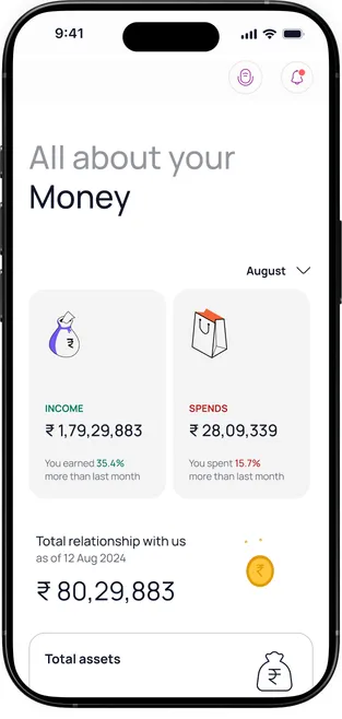
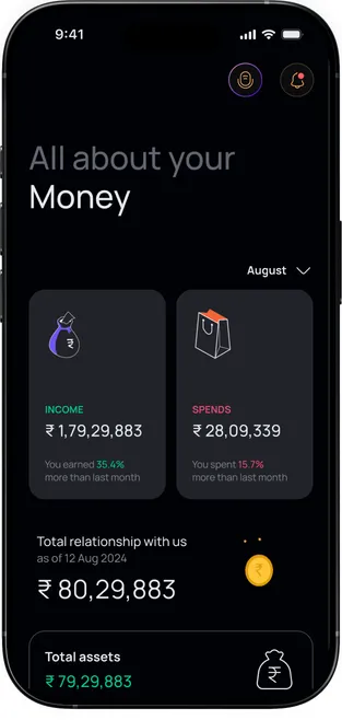
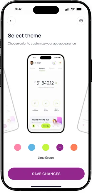
Themes.One design library, three looks.
The bank asked for three separate designs. We proposed one library with three looks (General, HNI and a lime POP look for younger customers) that switch with a setting instead of being redrawn.
General: the default look, in the bank's purple.
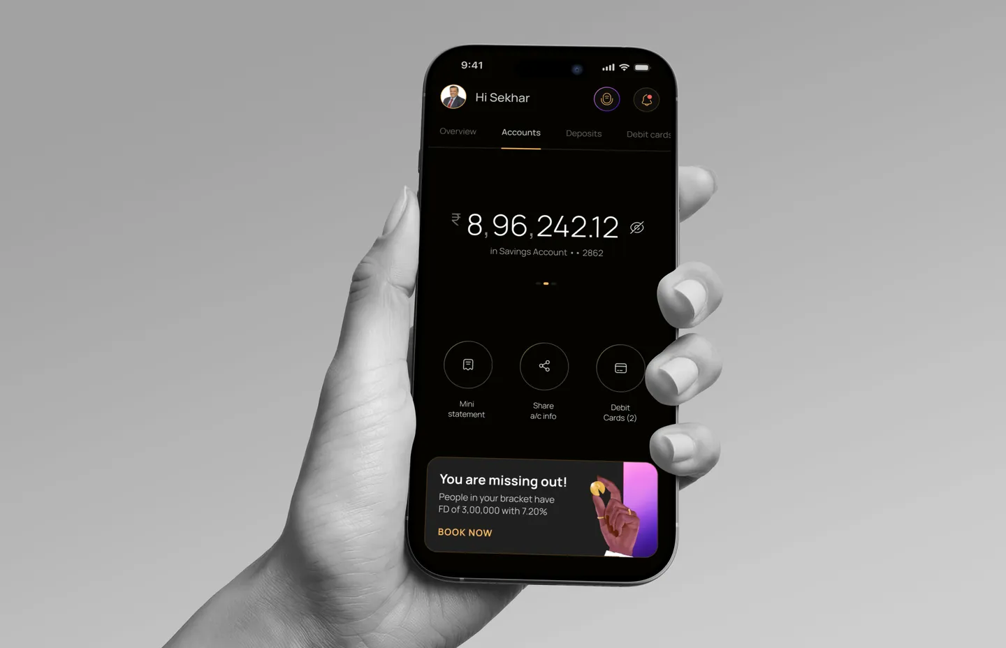
HNI: a dark look for high-value customers.
Lime POP: five accents for younger customers, previewed before you save. Buttons and controls pick up the accent too.
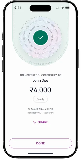
Every payment ends with a clear answer.
41% of people weren't sure a payment had gone through. Before, the app showed a receipt and an OK button, and nothing after.
Payment success
Social validation
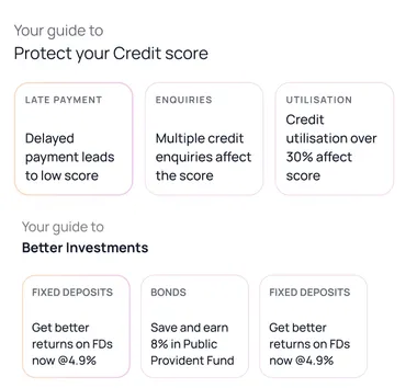
Personalised advice
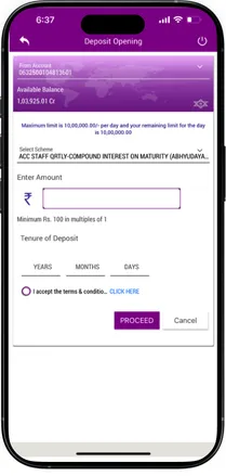
One long form became short interactive steps.
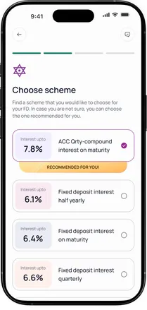
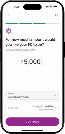
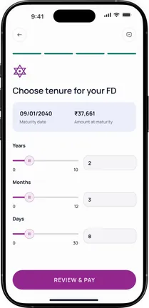
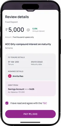
The old app asked for scheme, amount, tenure and terms on one screen. Now each step asks one thing, suggests a scheme, and shows the maturity amount before you pay.
Before
After
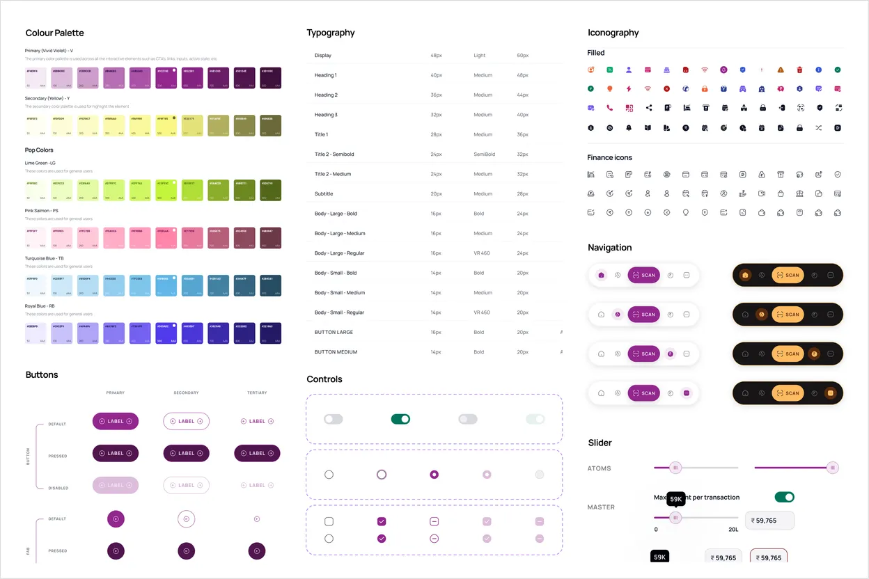
Design system.A system that carries a 100-year-old brand, and that the bank can extend.
Every colour pair passes accessibility contrast checks, in light and in dark. I built half of the component library with our visual designer.
brand tokens
296
aliases
95
mapped tokens and modes
70 × 3
type styles
22
icons
120+
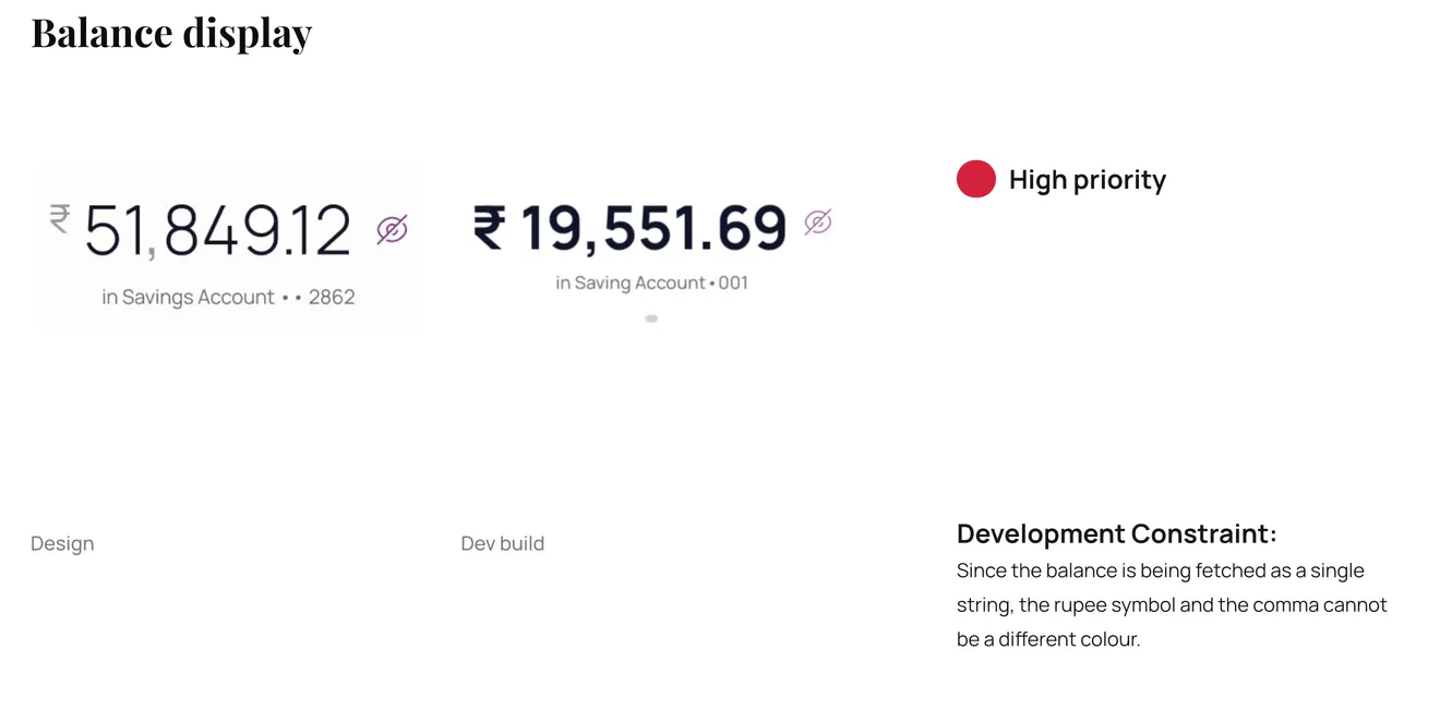
Handoff.Two days with the developers fixed fonts and spacing in the build.
Two builds came back with the wrong fonts, padding and margins. We spent two days with LCode's iOS and Android teams in their office and checked that the design values carried into the app.
Text and spacing now scale with the phone's own text size. Specs, notes and logic flows lived in one Figma file, and every sprint build was checked against it.
04What changed
Better in testing, and rated 4.7after launch.
EEarly testing came first, with the bank's own staff. Then the app shipped on iOS and Android in January 2026.
Early testing
rise in user satisfaction
81%
faster task completion
50%
fewer drop-offs
67%
Measured in early testing with the bank's own staff.
Checked 30 September 2026. Store ratings mix design with server reliability and a forced move from the old app, so they aren't a clean before and after.
What customers say
Before
Despite being a bank that has been around for a hundred years, there is still no user-friendly app.
App Store review, February 2024
After
The new interface is clean, modern, and easy to navigate.
App Store review, September 2026
After
Very neatly designed app. All the banking services are arranged in an organised manner.
Google Play review, July 2026
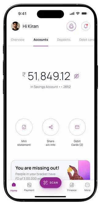
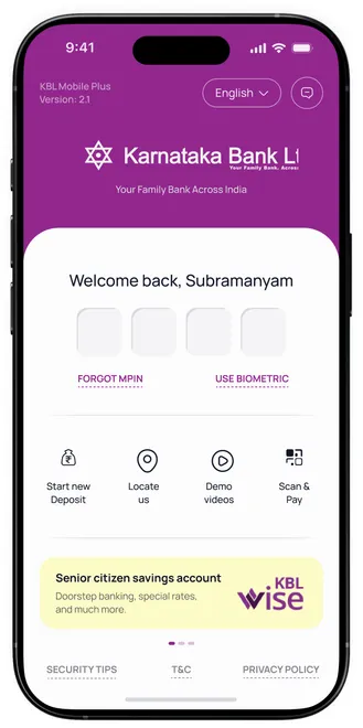
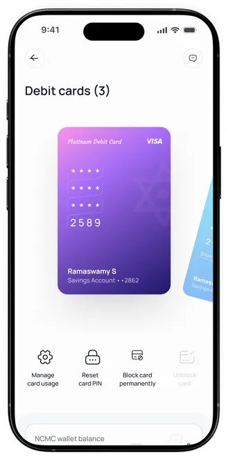
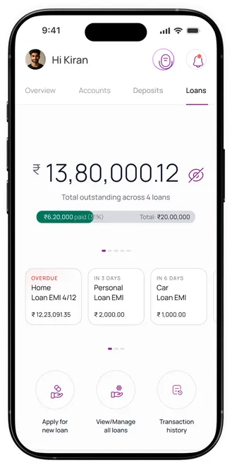
Shipped screens
What I got wrong.I designed for the data I wished we had.
I based the recent transactions and statement screens on the best competitor patterns, not on what the bank's system could send. In the development audit, LCode showed that half that detail wasn't available. We redesigned late.
I treated competitors as the spec. Now I ask for real data from the system before I draw any screen that shows it.
What I'd keep,what I'd change.
01Put the limits in writing, earlyWriting down what design couldn't fix, in front of the bank's leaders, kept us focused on what we could.
02Ask for real data firstReal data from the bank's system comes before any screen that shows it.
03Write findings down the same weekUsability findings were never formally reported. Next time they go into a shared doc right away.
Still open: UPI and bank payees live in two separate lists, and server problems drive most one-star reviews.